Green is one of the easiest colours to style well, but it can also look flat or overly loud if the surrounding palette is wrong. The best colors that go with green depend on the shade, the fabric and the setting, whether you are choosing a shirt for a suit, a wedding guest outfit or a smarter casual look. In this guide I break down the combinations that actually work, why they work, and when I would choose each one.
The smartest way to pair green is to follow undertone, contrast and occasion
- White, ivory, navy and charcoal are the most reliable partners for almost any green.
- Olive and sage behave more like neutrals, so they work best with beige, tan, brown and soft blue.
- Forest and emerald can handle sharper contrast, especially with black, silver and burgundy.
- Burgundy, plum and blush give green a richer, more refined edge than pure red usually does.
- For formalwear, shirt colour, tie colour, shoes and watch metal matter as much as the suit itself.
- If in doubt, keep one colour dominant and let the rest support it rather than compete with it.
Why the shade of green changes everything
Green is not one fixed colour. Olive, sage, moss, forest and emerald all carry a different temperature and energy, and that changes what sits comfortably next to them. Muted greens can behave almost like neutrals, while saturated greens need cleaner companions so the outfit does not start to feel busy.
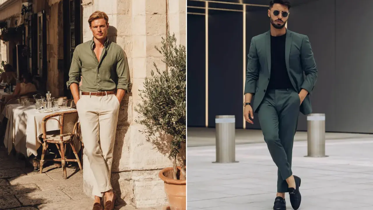
I always start with two questions: is the green warm or cool, and is it muted or vivid? Warm, earthy greens like olive and moss are usually easiest to pair with beige, tan, brown and ivory. Cool, deep greens like forest and emerald often look better with crisp white, charcoal, black and silver.
There is also a colour-theory reason behind this. Analogous pairings, which sit next to each other on the colour wheel, create a softer transition, while complementary pairings create more tension and contrast. In clothing, that usually means green feels calm beside blue or yellow-green, and more striking beside reds, burgundies and pinks. Once you read the undertone correctly, the rest of the choices become much less guesswork.
That is why I do not treat every green outfit the same way. The shade decides the direction, and the next step is choosing the most dependable partners.
The colours I trust most with green
When I want a safe result, I start with neutrals. They give green room to breathe and stop the outfit from becoming overdesigned. In formalwear especially, that restraint usually looks sharper than trying to force a loud combination.
| Colour | Why it works with green | Best use |
|---|---|---|
| White | Creates the cleanest contrast and works with almost every green shade. | Shirts, shirts and ties, wedding guest tailoring. |
| Ivory or cream | Softens the look and feels warmer than pure white. | Daytime weddings, country events, olive or sage tailoring. |
| Navy | Feels polished without fighting green for attention. | Blazers, ties, knitwear and layered smart-casual looks. |
| Charcoal or grey | Lets deep green feel refined and slightly more urban. | Evening wear, business tailoring and colder-weather outfits. |
| Beige, tan or camel | Echoes the earthy side of green and keeps the palette natural. | Spring and autumn looks, lighter suits, country-style dressing. |
| Brown | One of the strongest combinations for olive and forest green. | Shoes, belts, tweed, knitwear and relaxed tailoring. |
| Black | Gives high contrast, but works best with darker greens. | Evening looks, sharp accessories and minimal styling. |
For most men, these are the foundation colours. They do not just match green; they frame it properly. Once that base is in place, you can add a stronger accent without making the outfit feel noisy.
Richer contrast colours that still feel elegant
When I want green to look more distinctive, I move beyond the obvious neutrals. The trick is to choose colours with enough depth to feel intentional. Bright, primary red or very loud orange tends to fight with green, but deeper, softened versions can look excellent.
- Burgundy and wine add the richest contrast to forest green and emerald. They feel formal, mature and slightly luxurious.
- Plum and aubergine work well when you want a more editorial look. They are especially good with dark green eveningwear.
- Blush and dusty rose soften green without making the outfit childish. I like them with sage, mint and lighter tailoring.
- Gold, brass and bronze are ideal as accents rather than full blocks of colour. They bring warmth to olive and moss tones.
- Silver and pewter suit cooler greens better, especially emerald and pine. They keep the look crisp and clean.
- Teal and blue-green create a tonal pairing that feels modern and controlled, not matchy in a bad way.
The point here is balance. Green can handle character, but only when the supporting colour has the right depth. If the accent is too bright, the whole outfit starts to look less tailored and more accidental.
How I would style green for formalwear and weddings
For formalwear, green is strongest when it feels deliberate rather than novelty-driven. In the UK, I find it works especially well for spring weddings, country-house events, race days and evening receptions, because the colour has enough personality to stand out without looking forced.
| Occasion | Green tone | Shirt | Tie or accessory | Shoes and watch |
|---|---|---|---|---|
| Daytime wedding | Olive, sage or moss | Ivory or white | Burgundy tie, cream pocket square | Brown brogues and a gold-tone watch |
| City wedding or evening reception | Forest or emerald | Crisp white | Navy or black tie, silver cufflinks | Black Oxfords and a silver or steel watch |
| Smart country look | Olive blazer or suit | Light blue | Chocolate tie or patterned silk square | Dark brown shoes and a brown leather strap watch |
| More fashion-forward guest outfit | Deep green with texture | White or soft cream | Plum tie or burgundy knitted tie | Black loafers or monks and a minimal metal watch |
Accessories deserve the same level of thought. A pocket square can bridge the gap between shirt and tie, and a watch can quietly support the palette. I often prefer gold with olive and silver with emerald, because the metal tone subtly reinforces the temperature of the green.
That approach gives you a polished look without making the outfit feel overworked, which leads directly to the mistakes that usually throw the balance off.
The mistakes that make green harder to wear than it is
Most bad green combinations are not really about the colour itself. They happen because the shade, contrast or finish has been chosen without enough control. Once you know the common traps, green becomes much easier to wear well.
- Treating every green the same leads to lazy pairings. Olive and emerald need different companions.
- Using pure red too literally often looks festive rather than refined. Burgundy or wine is usually the better choice.
- Going too bright too quickly can make the outfit feel costume-like. That is especially true with lime or chartreuse.
- Ignoring the watch metal or shoe colour breaks the visual line. Warm green with cold accessories often feels unfinished.
- Matching similar shades without texture can flatten the look. If you want tonal green, vary the fabric weight and finish.
- Forcing black with a warm muted green can make the green look dull. In that case, charcoal, chocolate or navy is often better.
My rule is simple: if the combination makes the green look dirtier, flatter or louder than intended, the supporting colour is probably wrong. Once those pitfalls are out of the way, the simplest rule becomes surprisingly easy to follow.
How to make green feel deliberate instead of decorative
If I had to reduce the whole topic to one practical rule, it would be this: choose the partner colour based on the green’s undertone, then let the occasion decide how much contrast you use. White, ivory, navy and charcoal are the safest defaults; brown, camel and beige make green feel grounded; burgundy, plum and gold add depth; silver and black sharpen the look for evening.
For men’s formalwear, that usually means one green garment, one controlled neutral and one accent that does not fight for the spotlight. When green is the feature, the rest of the outfit should act like a frame, not a competition. That is the difference between a look that feels styled and one that simply feels colourful.
When in doubt, I would still start with a white shirt, a dark tie, brown or black shoes depending on the shade of green, and a watch that matches the temperature of the outfit. From there, you can add personality with texture, pattern or a deeper accent colour without losing clarity.