Navy trousers are one of the easiest foundations in menswear, but the shirt colour you choose decides whether the outfit feels formal, relaxed, or slightly too safe. I usually treat the shirt as the main decision point: get that right, and the rest of the look becomes much easier to finish with shoes, a tie, and the right fabric choice. This guide breaks down the shirt colours that work best with navy trousers, where each one fits, and the mistakes I still see most often.
The cleanest combinations rely on contrast, restraint, and the right amount of texture
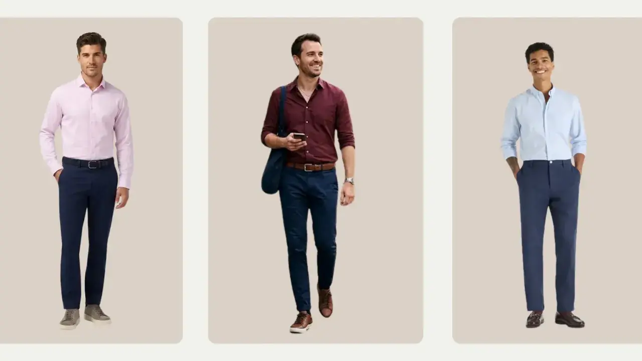
- White is the sharpest and most formal choice for navy trousers.
- Light blue is the safest everyday option because it softens the contrast without losing clarity.
- Soft pink, pale lilac, and light grey add character while staying refined.
- Black and charcoal shirts can work, but they are best kept for evening or fashion-led outfits.
- Patterns should stay subtle if the trousers are already a deep navy and the event is formal.
- Brown shoes usually finish the look best, while black shoes push it towards stricter formality.
The safest shirt colours to start with
When I am choosing a shirt for navy trousers, I start with the colours that create clear contrast without fighting the trousers. That usually means white first, then light blue, then the softer shades that add a little more personality without becoming difficult.
| Shirt colour | Why it works | Best use | Watch-outs |
|---|---|---|---|
| White | Creates the cleanest contrast and keeps navy looking sharp | Business wear, interviews, weddings, formal dinners | Can look too stark if the fit is poor or the fabric is thin |
| Light blue | Sits naturally next to navy without looking matched | Everyday office wear, meetings, smart daytime outfits | Choose a lighter shade than the trousers so the outfit keeps depth |
| Soft pink | Adds warmth and freshness while staying elegant | Weddings, client lunches, spring and summer events | Works best when the pink is pale rather than saturated |
| Light grey | Feels modern, restrained, and quietly polished | Minimal looks, cooler seasons, understated tailoring | A dark grey shirt can flatten the outfit and drain contrast |
| Pale lilac | Brings a refined, slightly more distinctive edge | Spring weddings, evening events, fashion-conscious office looks | Keep it pale so it does not compete with the navy |
| Black or charcoal | Pushes the outfit towards evening wear and stronger visual weight | Night-time events, creative settings, sharper modern looks | Can feel heavy in daylight and less versatile than lighter shades |
Once the colour is right, the setting decides the rest. A shirt that is perfect for a boardroom can feel too flat at a wedding, and a slightly more expressive colour can look excellent when the occasion allows it.
Match the shirt to the setting, not just the trousers
Navy trousers can look boardroom-ready, wedding-appropriate, or quietly relaxed depending on the shirt and fabric. I find that most mistakes happen when someone picks a shirt colour in isolation and ignores the event.
Office and business dress
For offices, interviews, and client-facing settings, white and light blue are the strongest options. White is the cleanest if you want authority and precision; light blue feels a touch softer and is often more forgiving if the rest of the outfit is already dark. A pale striped shirt can also work, provided the stripe is fine enough that it reads almost solid from a distance.
Weddings and formal events
For weddings, I usually prefer white, pale blue, or a restrained pink. White is the safest if the dress code leans formal. Pale pink has enough warmth to feel celebratory without becoming flashy, which is useful for daytime receptions and summer ceremonies. If the wedding is in the evening or the setting is more contemporary, a pale lilac shirt can look elegant rather than predictable.
Read Also: Black Suit Combinations - Master Your Style
Smart casual and evening wear
If the trousers are navy chinos or a softer fabric, you can widen the palette slightly. Chambray, brushed cotton, and deeper shades like charcoal or black become more realistic here, especially when you want the outfit to feel modern rather than traditional. The trade-off is that these shades need cleaner shoes and a stronger fit, because they show any sloppiness quickly.
Once the occasion is clear, texture becomes the next lever for making the outfit feel intentional rather than generic.
Patterns and textures that make navy feel sharper
Patterns are useful with navy trousers because they let you add depth without abandoning restraint. The key is to keep the shirt quiet enough that navy remains the lead colour, not one half of a visual argument.
- Fine stripes work well when you want structure without a plain-shirt feel. A white shirt with pale blue or grey stripes is especially reliable for work.
- Micro-checks are good when you want a little more personality. From a normal viewing distance, they should still read as calm and professional.
- Poplin gives the crispest finish. It is the safest fabric when the trousers are tailored and the setting is formal.
- Twill adds a slight sheen and a more substantial hand feel. I like it for autumn and winter because it stands up better next to heavier navy wool.
- Oxford cloth is more relaxed. It can work with navy trousers, but it shifts the look away from classic dress shirt territory.
The mistake I see most often is choosing a pattern that is too busy. Navy already has enough visual weight; if the shirt is loud as well, the outfit starts to feel crowded. A restrained stripe or a barely-there check is usually enough.
That balance matters even more once you start looking at the accessories, because shoes and ties decide whether the combination feels polished or unfinished.
The shoes, belt, and tie colours that finish the look
Shirt colour does most of the work, but the accessories decide whether the outfit feels polished or incomplete. Navy trousers are flexible, which means the wrong shoe or tie can either elevate the combination or make it feel oddly unfinished.
| Accessory colour | What it does | Works best with |
|---|---|---|
| Dark brown | Adds warmth and keeps navy from looking too cold | White, light blue, pink, and most textured shirts |
| Black | Raises the formality level and sharpens the silhouette | White shirts, evening looks, and strict dress codes |
| Oxblood or burgundy | Adds depth without shouting | White, pale blue, and soft pink shirts |
| Tan | Lightens the outfit and makes it feel more relaxed | Spring and summer outfits with lighter shirts |
For ties, I lean towards mid-grey, burgundy, dark green, or a textured navy that is visibly different from the trousers. The one thing I avoid is a tie that is too close to the trouser colour, because matching blues can look accidental rather than deliberate. If the shirt is already light and clean, a tie with texture is often enough to finish the outfit.
I also keep the belt honest: it should usually match the shoe leather. If you wear a watch, a steel case sits naturally with white, blue, and grey shirts, while gold feels more convincing once the shirt turns warmer. Small details like that matter because they keep the outfit from feeling assembled in pieces.
That balance matters even more once you start looking at the most common mistakes, because navy is forgiving right up until the moment it is not.
The mistakes that make navy trousers harder to wear
Navy trousers are easy to buy but not always easy to style well. A few small errors can flatten the outfit, even when every piece is expensive.
- Wearing a shirt that is too close in colour to the trousers. If the blues are nearly identical but the fabrics are not, the outfit can look accidental or uniform-like.
- Choosing a shirt with a harsh undertone. Very cool blue, very warm cream, or overly saturated pink can clash with the navy if the lighting is unkind.
- Going too dark too quickly. A black shirt with dark navy trousers can look elegant at night, but in daylight it often feels heavy unless the fit and accessories are excellent.
- Ignoring fabric weight. A flimsy shirt can make expensive trousers look ordinary, while an overly shiny shirt can make the whole outfit feel dated.
- Forgetting the shoes. Even the right shirt colour can look off if the footwear introduces a completely different mood.
In British offices and wedding venues, lighting also matters more than people expect. An outfit that looks balanced indoors can feel flatter under daylight, so I always check navy-on-navy combinations in natural light before I settle on them. That is where the safest combinations prove their value.
A simple formula I trust when the outfit has to work
If I want the safest possible result, I use a formula rather than guessing. For navy trousers, that formula is straightforward: light shirt, restrained texture, warm shoes, and one clean accent. It works because each piece supports the others instead of competing for attention.
- For maximum formality: white shirt, black or dark brown shoes, understated tie.
- For day-to-day office wear: light blue shirt, dark brown shoes, grey or burgundy tie.
- For weddings or smarter social events: pale pink or pale lilac shirt, brown shoes, textured tie.
- For a more modern look: pale striped shirt, oxblood shoes, minimal accessories.