Colour does more work in a shirt than most men expect. It changes how formal a suit feels, whether a tie looks deliberate, and how much room there is for personality without losing polish. In practice, I treat dress shirt colors as the quickest way to control contrast and tone in a formal outfit.
For a UK wardrobe, the useful range is narrower than the internet sometimes makes it seem: white, pale blue, soft pink, restrained stripes and a few tasteful off-white shades cover most situations. In 2026, the direction is still towards cleaner classics rather than loud novelty colours, which is exactly why this topic matters.
The safest shirt shades still do most of the work
- White is still the most formal and the easiest to pair with tailoring.
- Pale blue is the best everyday alternative because it softens dark suits without losing sharpness.
- Pale pink adds warmth and personality, especially with navy or grey.
- Fine stripes and subtle textures are useful once the basics are already covered.
- Dark shirts are situational; they can look good, but they are rarely the smartest default.
The four shades worth owning first
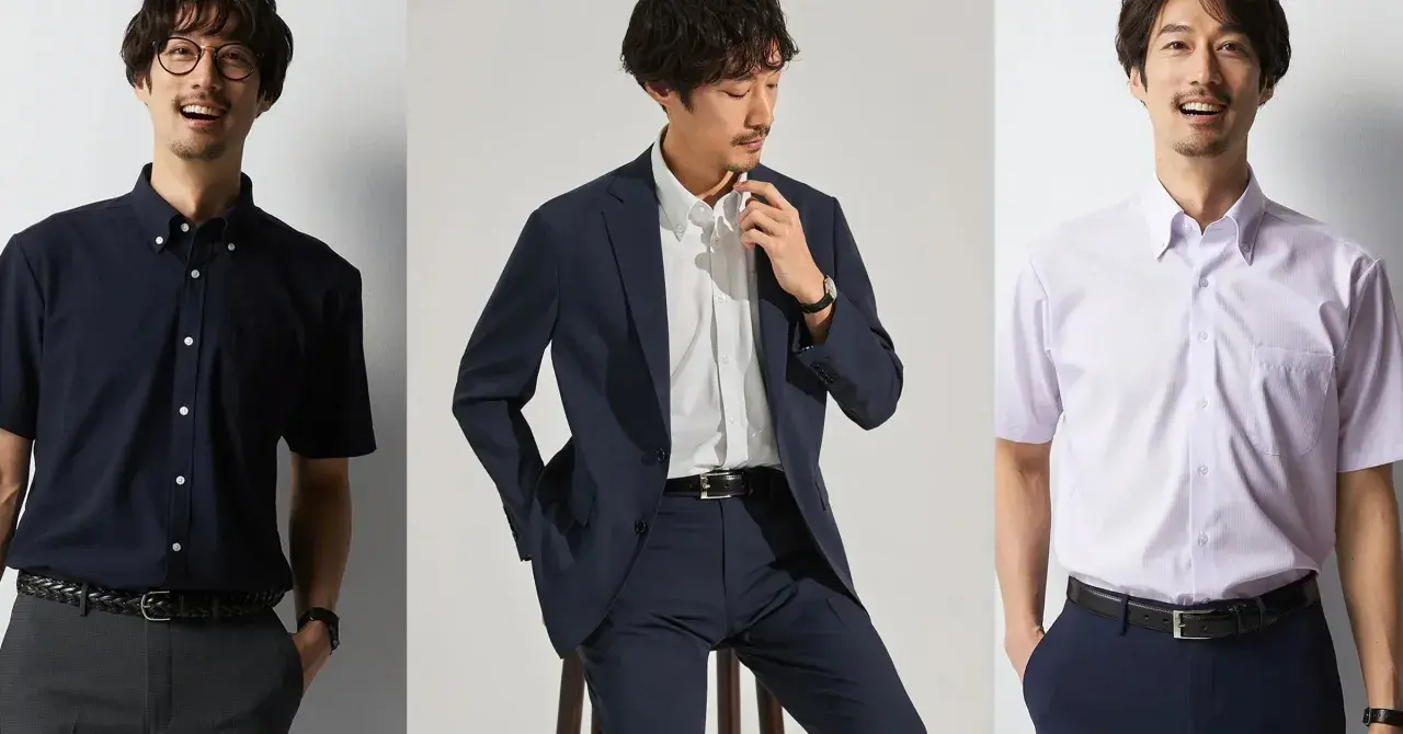
White is still the anchor. It looks the sharpest under navy and charcoal, reads as the most formal, and gives the cleanest backdrop for ties and accessories. If a shirt needs to behave in almost every setting, white is the one that rarely misfires.
Pale blue is the workhorse. It softens dark tailoring, wears well in daylight, and is the easiest way to move beyond white without looking overstyled. I reach for it when I want the outfit to feel polished but not severe.
Pale pink adds warmth. Under navy it feels confident; under grey it feels refined. I use it more often for spring, weddings and modern office settings than for conservative boardrooms, because it needs a little context to look its best.
Fine stripes earn their place once the basics are covered. A narrow blue stripe or a restrained Bengal stripe gives movement without making the shirt fight the suit. It is the simplest way to add interest while staying inside formalwear rules.
If I were building a small but effective rotation from scratch, I would buy two whites, two pale blues and one pink or striped shirt. That is a workable five-shirt foundation, and I have yet to see a wardrobe improved by buying the loud options first. Once those base colours are in place, the real work is matching them to the suit.
How shirt and suit colour should work together
Good matching is about contrast, not copying. A shirt should either lift the suit or quiet it down; when the two are too close in tone, the outfit usually looks accidental rather than deliberate. That is why navy and charcoal suit so much of British formalwear so well: they leave room for the shirt to define the mood.
| Shirt colour | Best suit partners | Why it works | Where I would use it |
|---|---|---|---|
| White | Navy, charcoal, black, dark green | Highest contrast and the cleanest formal read | Interviews, offices, weddings, evening wear |
| Pale blue | Navy, grey, brown | Softens dark tailoring without losing polish | Daily office wear and daytime events |
| Pale pink | Navy, grey, medium blue | Adds warmth and personality | Spring and summer weddings, modern offices |
| Cream or ivory | Navy, charcoal, brown | Less stark than white and slightly more relaxed | Weddings and elegant evening looks |
| Fine stripe | Navy, grey, brown | Adds movement without breaking formality | Business settings that need variety |
| Dark shirts | Very dark suits or no-tie evening looks | Strong mood, weaker versatility | Style-led occasions, not standard formalwear |
The line I use is simple: if the suit is serious, the shirt should be clear. White gives the strongest contrast, pale blue gives the softest professional look, and cream or ivory adds a quieter, slightly more romantic tone. Dark shirts can work, but only when the dress code is intentionally relaxed or fashion-led. Once the shirt and suit are aligned, the tie is what changes the tone from standard to deliberate.
What tie colour does to the final effect
The tie matters because it sits between the shirt and the suit, so it either completes the story or makes the whole outfit feel overworked. With a white shirt, almost any tie can work, but burgundy, navy and dark green are the safest choices because they give the outfit direction without competing with the shirt.
Pale blue shirts are easier to style than many men realise. Navy, burgundy, silver-grey and small patterns all work because the shirt is already doing part of the visual balancing. If I want the outfit to stay refined, I keep the tie textured rather than glossy.
Pale pink shirts need the tie to stay grounded. Burgundy, navy, charcoal and dark green are the colours that keep the shirt elegant rather than sugary. Cream or ivory shirts also benefit from deeper ties, because a very pale tie can leave the whole look washed out.
Accessories matter too. A silver watch usually feels neatest with white or blue shirts, while gold or rose gold can look better against cream and pink. Keep belt and shoe colour anchored to the suit, not the shirt, or the whole outfit starts to drift. When the tie is simple, pattern and fabric become the next tools for adding depth.
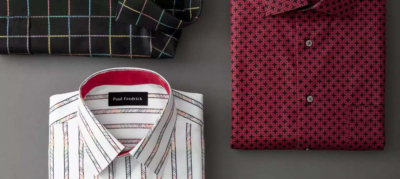
When patterns and texture are the smarter choice
Patterns are useful when plain colour feels too severe, but they only work if the scale stays disciplined. Fine stripes add interest while staying business-friendly, while checks push the shirt a little further towards smart-casual territory. I would not use a bold check under a busy jacket unless the rest of the outfit is deliberately quiet.
- Fine stripes add interest without breaking formality.
- Checks read more casual and need cleaner tailoring around them.
- Poplin is the crispest option; twill looks softer and slightly richer; Oxford reads more relaxed.
- Texture is the easiest way to make a plain shirt feel expensive without moving into loud colour.
The most overlooked point is that fabric changes how colour reads. A white poplin shirt looks cleaner and more formal than a white Oxford shirt. A pale blue twill feels deeper and more relaxed than the same shade in poplin. If I want an outfit to feel layered without being busy, I prefer texture before I reach for a stronger shade. That leads directly to occasion, because the right shirt colour is not the same for an office, a wedding or a black-tie invite.
Which shirt colours fit UK offices, weddings and evening wear
For the office, I would still prioritise white and pale blue. They cover interviews, presentations and client meetings without making the outfit feel overstyled. A fine stripe is a good third option when you want variation and your workplace is not rigidly formal. In practical terms, that means a white shirt for the sharpest days, pale blue for the everyday days, and a stripe when the week starts to feel repetitive.
For UK weddings, pale blue and pale pink become much more useful. They work beautifully with navy and mid-grey suits, especially at daytime or spring and summer events. Cream or ivory is also worth considering if the wedding leans formal or you want something slightly softer than white. A navy suit with a white shirt still wins for classic formality, but it is not the only tasteful answer.
For evening wear, the rules tighten. If the dress code is truly formal, white is still the safest choice, and a proper evening shirt beats a fashion shirt every time. Dark shirts can work in a style-led setting, but they are usually a deliberate choice rather than the standard answer. That is the point where taste matters more than novelty, which is why the next question is what to avoid before buying another shirt.
The mistakes I would avoid before buying another shirt
The biggest mistake is buying loud colours before the basics are covered. I see this constantly: men want variety, but the wardrobe is missing the white shirt that would have solved half the outfits. The second mistake is matching the shirt too closely to the suit, which flattens the look and makes even good tailoring feel ordinary.
- Buying loud colours before the basics are covered.
- Matching the shirt too closely to the suit, which flattens the outfit.
- Choosing a busy pattern under an already patterned jacket.
- Ignoring daylight, where weak colours often look dull or muddy.
- Assuming a darker shirt automatically looks smarter. It often does the opposite in formalwear.
If a shirt only looks good under artificial light or only feels impressive on the hanger, I pass. The colour has to work in the real world, not just in a fitting room. If the wardrobe still feels inconsistent after that, the fix is usually a smaller, more disciplined palette rather than another new colour.
The simplest wardrobe rule I keep when everything needs to work together
If I had to reduce the whole subject to one practical rule, it would be this: build around white first, then add pale blue, then choose one warm accent such as pink or cream once the core wardrobe is already doing its job. That is the most reliable way to make shirt colours earn their place instead of sitting in the wardrobe as options you rarely trust.
Once those shades are covered, the next upgrade is usually not a louder colour. It is a better collar, a better fabric, or a cleaner fit through the neck and shoulder so the shirt actually frames the face and sits properly under tailoring. That is where the outfit starts to look intentional rather than merely expensive.