The easiest colour rules are the ones that keep the outfit calm, contrasted and textured
- Keep most outfits to 2 or 3 colours; a fourth should usually be a small accent, not a second focal point.
- Navy, grey and brown are the most flexible sport coat colours because they pair cleanly with shirts, trousers and shoes.
- White, light blue and cream do most of the work at shirt level; the trouser choice then decides whether the look feels formal or relaxed.
- Texture matters as much as colour; flannel, hopsack and tweed make combinations look richer and more intentional.
- Brown shoes are the safest default, while black shoes should usually be reserved for darker or more formal outfits.
- In 2026, the strongest palettes are still muted, earthy and textural rather than loud or over-contrasted.
Start with one dominant colour and two supporting ones
The easiest way I know to build a good outfit is to decide what the jacket is supposed to do before I think about anything else. If the sport coat is the visual anchor, the shirt should support it, the trousers should either ground it or gently contrast it, and the shoes should finish the story without shouting. In practice, that means most outfits look better with one dominant colour, one secondary colour and one small accent than with a full rainbow of competing ideas.
I also try to think in terms of temperature. Warm shades such as brown, camel, olive and cream tend to feel natural together, while cooler shades like navy, grey and white feel sharper and more classical. Once that hierarchy is clear, the jacket colour becomes much easier to choose, and the rest of the outfit stops feeling improvised.
The jacket colours I would start with
| Jacket colour | Easy partners | Best use | What to watch |
|---|---|---|---|
| Navy | White, light blue, pale pink, grey flannel, stone chinos, dark denim | Office wear, dinner, wedding guest outfits, dependable smart casual | A navy jacket can look flat if everything else is also navy or similarly dark |
| Grey | White, pale blue, cream, navy trousers, charcoal flannel, dark denim | City looks, meetings, clean modern tailoring | Light grey on light grey needs texture, otherwise the outfit can disappear |
| Brown or camel | Cream, ecru, pale blue, olive, navy, stone, dark indigo | Autumn, country settings, richer casual tailoring | Very cool shirts can feel disconnected unless another warm element bridges the look |
| Olive or dark green | White, cream, chambray blue, stone, navy, dark denim | Smart casual, weekend lunches, relaxed tailoring | Too much khaki nearby can make the palette muddy rather than considered |
| Burgundy | White, soft blue, grey, charcoal, navy, dark denim | Evening, dinner, creative office settings | It already has presence, so the rest of the outfit should stay controlled |
| Black | White, charcoal, black knit, grey, black trousers | Mostly evening or very pared-back looks | Black is unforgiving in daylight and needs texture to avoid looking severe |
Once the jacket colour is set, the shirt and trouser pairing should either support it quietly or create a clear, intentional contrast. That is why I treat the coat as the anchor before I start looking at the rest of the outfit.
Shirts and trousers that make the outfit look intentional
Most colour mistakes happen when the jacket is strong but the shirt and trousers are chosen in isolation. I prefer to build the look from the inside out, starting with a shirt that either calms the jacket or sharpens it, then choosing trousers that keep the whole palette coherent.
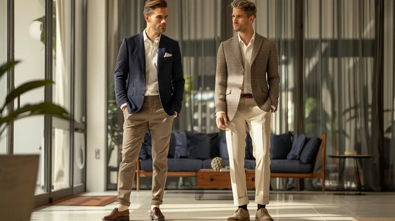
- Navy coat pairs best with a white or light blue shirt and grey flannel, stone chinos or dark denim. It is the cleanest route to a polished British smart-casual look.
- Grey coat likes white, pale blue or a fine knit underneath, with navy or charcoal trousers. The contrast stays crisp without feeling harsh.
- Brown coat looks strongest with cream, ecru or pale blue above navy, taupe or stone below. This is where warm colour matching feels most natural.
- Olive coat needs restraint: white or cream shirt, then navy, stone or dark indigo underneath. Too much khaki nearby can make the outfit look muddy.
- Burgundy coat works with a white or soft blue shirt and grey, charcoal or navy trousers. The jacket already has enough presence, so the rest should stay controlled.
Dark indigo jeans can also work, but only when the denim is clean, the jacket is textured and the shirt is doing some of the formal work. Once the base palette is set, texture becomes the next lever.
When texture and pattern do more work than extra colour
Colour is only half the story. A navy jacket in smooth worsted wool reads more formal than the same navy in hopsack, and a brown tweed coat can suddenly make cream or olive look much richer than a flat cotton jacket would. That is why I pay as much attention to fabric as I do to hue.
- Hopsack is a loose basket weave that gives the fabric air and surface interest, which is why it softens stronger colours like navy.
- Flannel absorbs light and makes grey, brown and burgundy feel deeper and more autumnal.
- Tweed is the easiest place to use earthy colour because the texture already does part of the visual work.
- Checks and herringbone should usually be paired with solid shirts and quiet trousers so the eye has somewhere to rest.
- Stripes can lengthen the frame, but I would avoid mixing multiple strong patterns unless the palette is extremely restrained.
If you are unsure, remember this simple rule: one patterned item, one textured item and one quiet anchor are enough. That balance keeps the outfit interesting without making it feel busy, which leads neatly into the role of shoes and accessories.
Shoes, belts and accessories should support the palette
Shoes and accessories should reinforce the temperature of the outfit, not create a second argument. Brown leather is the safest partner for most sport coats, black belongs mainly to darker or more formal looks, and burgundy works as a useful middle ground when the palette needs depth.
- Brown shoes pair naturally with navy, brown, grey and olive coats.
- Black shoes work best with grey, black and the darkest navy, especially at night.
- Burgundy shoes are a smart bridge colour for navy and grey because they feel polished without looking severe.
- Belts should follow shoe depth, not chase an exact colour match.
- Ties and pocket squares should add one accent colour or texture, not repeat the jacket colour too closely.
- Watch straps are easiest to coordinate when they echo the shoes: brown leather with brown or olive outfits, metal bracelets with cooler navy or grey palettes.
The cleaner the jacket colour, the more room you have for a slightly stronger accessory; the busier the coat, the quieter the finishing pieces need to be. That balance matters even more once the season starts changing the way colour reads.
Seasonal combinations that suit the UK calendar
In the UK, season changes the mood of the colour as much as the temperature changes the fabric. In 2026, the most convincing looks are still leaning towards muted neutrals, olive, brown and grey rather than hard, high-contrast palettes.
- Spring and summer: navy with a white shirt, stone chinos and brown loafers gives you contrast without heaviness. Light grey linen or hopsack with pale blue and off-white also works well when the weather is warm but still changeable.
- Autumn: brown or olive with cream knitwear, navy flannels and suede shoes looks right because the colours share the same earthy register as the season.
- Winter: charcoal, deep navy and burgundy come into their own in wool and flannel. I prefer slightly darker trousers here because they stop the jacket from floating visually.
- Country weddings: brown, olive and cream can feel more thoughtful than a glossy dark suit, especially with textured cloth and a tie in a muted pattern.
- City evenings: navy or grey still gives the safest balance, particularly when the shirt is white and the shoes are polished.
The goal is not to match the season literally; it is to let daylight, cloth weight and occasion steer the palette in the same direction. Once that is handled, the biggest mistakes become much easier to spot.
Common mistakes that make good colours look wrong
Most colour mistakes are not dramatic. They just make an otherwise good jacket look a bit confused, which is usually worse because the outfit almost works.
- Using too many strong colours at once is the fastest way to lose clarity. One accent is enough.
- Going too tonal without texture can make the outfit look flat, especially with navy on navy or grey on grey.
- Ignoring undertones creates awkward results. A warm brown coat usually looks better with cream, camel or soft blue than with a cold, icy shirt.
- Relying on black as the default can make a daytime outfit feel severe. Black is a tool, not a rule.
- Letting pattern and colour fight each other is common. If the jacket is checked, keep the shirt and trouser palette quiet.
- Forgetting the shoes breaks the composition faster than most people realise. A great jacket can be dragged down by the wrong footwear.
When in doubt, reduce rather than add. The best-looking outfits usually owe their success to what was left out, which is why I would build the rotation below before I start experimenting.
The outfit formulas I would build first
If I were building a compact rotation for most men in Britain, I would start with these five looks.
- Navy sport coat, white shirt, grey flannel trousers, brown derbies - the most reliable combination for work, dinner and semi-formal events.
- Grey jacket, pale blue shirt, navy trousers, dark brown loafers - crisp enough for meetings, relaxed enough for evening drinks.
- Brown jacket, cream shirt, stone chinos, suede loafers - warm, approachable and especially strong from September through March.
- Olive jacket, white shirt, dark indigo denim, tan shoes - a sharper smart-casual option that still feels easy.
- Burgundy jacket, soft blue shirt, charcoal trousers, dark brown shoes - slightly more distinctive without tipping into novelty.
If you keep the palette to three colours, let texture carry part of the interest and choose accessories that echo the jacket rather than compete with it, the result will usually look deliberate. That is the most practical way I know to make colour matching work with a sport coat, whether the setting is office, dinner or a British wedding guest outfit.