Choosing suit colors is really about balancing versatility, formality and how the shade works with the rest of the outfit. The useful range is wider than navy and grey, but not every colour earns the same place in a wardrobe. In this guide I focus on the shades that actually pull their weight, how to match them, and where the bolder options make sense.
The quickest way to narrow the palette is to start with what works most often
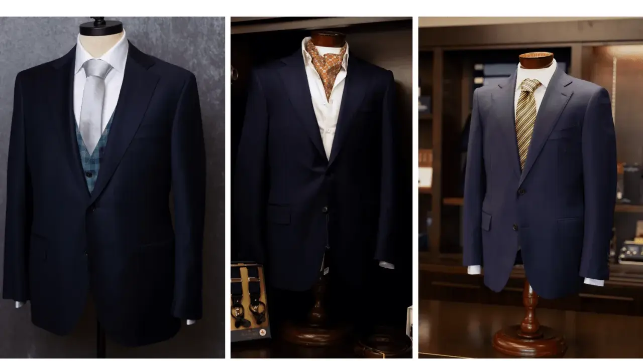
- Navy and charcoal do most of the heavy lifting in a modern wardrobe.
- Black is best kept for formal evening dress codes rather than everyday wear.
- Light grey, stone and soft blue feel more relaxed and work well in daylight.
- Brown, forest green and burgundy add personality, but they need stronger styling discipline.
- Good colour matching is less about copying tones exactly and more about creating clear contrast and balance.
- Fabric and lighting change how a colour reads, so the same suit can look sharper, softer or more casual depending on the cloth.
The core colours that earn their place
If I were building a suit wardrobe from scratch in the UK, I would start with the shades that can move between office wear, weddings and smart evening events without effort. That means treating the palette in two groups: anchor colours that do the practical work, and character colours that add variety once the basics are covered.
| Colour | Formality | Best use | What to watch |
|---|---|---|---|
| Navy | High | Work, interviews, weddings, evening dinners | The most versatile choice, but the shade should be deep enough to avoid looking like an office uniform |
| Charcoal | High | Business settings, funerals, conservative events | Looks refined, but can feel severe if paired with a heavy shirt and tie |
| Mid grey | Medium | Daytime weddings, smart office wear, lighter seasonal dressing | More flexible than people think, though it needs cleaner tailoring to avoid looking flat |
| Black | Very high | Black tie, evening formalwear, highly dressed-up occasions | Best kept for the right context; in daylight it can look harder than navy or charcoal |
| Brown | Medium | Autumn dressing, country weddings, relaxed tailoring | Works best in rich cloths rather than shiny finishes |
| Stone or beige | Low to medium | Spring and summer weddings, warm-weather events | Needs a strong fit and good fabric or it can look too casual too quickly |
| Light blue | Medium | Spring occasions, daytime celebrations, softer business looks | Best in lighter cloths; very pale versions can lose authority in formal settings |
| Forest green | Medium | Stylish weddings, fashion-forward office environments, evening events | Needs calm accessories so the look stays polished rather than novelty-driven |
| Burgundy | Medium | Creative events, winter weddings, evening receptions | Stronger than navy or grey, so it works best when the rest of the outfit is restrained |
That is the practical range I would recommend: first the colours that earn frequent wear, then the shades that add personality without becoming difficult. Once those anchor tones are clear, the next question is when each one actually belongs.
How I choose a colour for the occasion
The same suit can look either perfect or misplaced depending on where it is worn. In the UK, that matters because the dress code at a city office, a registry office wedding and a black tie dinner are not the same thing, even if they all ask for a suit.
| Occasion | Best colours | Why they work |
|---|---|---|
| Office and interviews | Navy, charcoal, mid grey | They look serious without being overly theatrical and they pair easily with simple shirts and ties |
| Wedding guest | Navy, grey, light blue, stone, soft green | They feel respectful but still fresh, especially for daytime or country-house settings |
| Groom | Navy, charcoal, midnight blue, deep green, burgundy | They photograph well and give the outfit enough identity without stealing the whole day |
| Black tie | Black dinner suit or midnight navy | This is one of the few cases where a very dark suit or tuxedo is the correct answer, not just a safe one |
| Smart casual or creative events | Brown, green, burgundy, patterned grey | These colours carry more personality, which suits less formal rooms and softer dress codes |
My rule is simple: the more formal the event, the cleaner and darker the colour should usually be. For a UK wedding, I would lean lighter for spring and summer, and richer for autumn and winter. For a black tie invitation, I would not improvise with a bright fashion colour unless the dress code explicitly gives you room to do that. From there, the next layer is how the colour behaves against your own complexion.
Which shades flatter different complexions
I do not treat skin tone rules as hard law, but they are useful when a man is choosing between otherwise good options. What usually matters most is contrast: how much the suit separates the face from the rest of the outfit.
- Cool undertones usually work well with navy, charcoal, blue-grey and crisp mid-grey. These shades echo cooler colouring and keep the look tidy.
- Warm undertones often suit brown, olive, stone, tan and warm grey better. The result feels softer and more natural.
- Neutral undertones can wear almost anything, so contrast becomes the bigger issue. If the face is high contrast, deeper shades usually look cleaner; if the colouring is softer, medium tones often feel easier.
- Very fair skin often benefits from deeper colours that create definition, while very deep skin tones can carry lighter suits beautifully when the fabric has enough texture.
The simplest test is still the best one: try the jacket in daylight, not under changing shop lighting. I have seen plenty of suits that looked refined indoors and then felt washed out or harsh outside. Once you know what suits your colouring, matching the rest of the outfit becomes much easier.
How to match the suit with shirts, ties and shoes
The easiest way to make a suit look expensive is not to overload it. I usually start with the shirt, then the tie, then the shoes, and only after that do I think about pocket squares or other extras. The principle is straightforward: the shirt should usually be lighter than the suit, the tie should sit slightly darker or more saturated than the shirt, and the shoes should match the formality of the suit rather than the exact colour.| Suit colour | Shirt colours | Tie colours | Shoe colours |
|---|---|---|---|
| Navy | White, light blue, soft pink | Burgundy, navy, forest green, muted pattern | Dark brown, oxblood, black for stricter settings |
| Charcoal | White, pale blue, subtle stripe | Deep burgundy, silver-grey, dark green | Black or very dark brown |
| Mid grey | White, blue, lilac | Navy, burgundy, navy with pattern | Black, dark brown, oxblood |
| Brown or tan | White, cream, light blue | Navy, forest green, rust, dark knit tie | Dark brown, chestnut, oxblood |
| Forest green | White, ecru, light blue | Burgundy, navy, dark silk or knit textures | Dark brown or oxblood |
| Black | White only for the cleanest formal look | Black for strict formalwear, or a deep burgundy if the setting is less rigid | Black |
- Do not match the pocket square exactly to the tie; that usually looks forced.
- Keep the watch strap in the same family as the shoes when possible.
- Let one element lead. If the suit is bold, the shirt and tie should calm things down.
- When in doubt, use a white shirt and make the tie the only obvious colour accent.
That approach keeps the outfit coherent without making it monotonous. But colour never lives alone, which is why fabric and pattern change the result more than many men expect.
Why fabric and pattern change the colour you see
The same navy can look sharp, relaxed or almost casual depending on the cloth. Worsted wool reads cleaner and more formal, flannel softens the colour, linen lightens it, and tweed or hopsack make it feel more textured and seasonal. That matters because a suit colour is never just the pigment; it is the colour plus the surface it sits on.
I see this most clearly with lighter shades. Stone, beige and light grey need enough texture to feel intentional, otherwise they can look flat or overly summery in the wrong room. On the other side, darker colours like charcoal and navy become more interesting when the cloth has a subtle weave, a faint herringbone or a soft matte finish.
Pattern follows the same logic. A plain grey suit is easier to style than a strong check, but a quiet Prince of Wales check can be a very smart move if you want depth without loudness. The rule I trust is simple: if the suit has visual complexity, keep the shirt and tie calmer. If the suit is plain, you have more room to use texture in the accessories.
Once you understand that, the common mistakes become much easier to spot.
The mistakes that make a good colour choice fall flat
- Buying black too early and then wearing it for everything. It is often too severe for daytime and too limiting as a first suit.
- Choosing a pale suit without enough structure. Light grey and stone need good tailoring or they can look underdressed fast.
- Trying to match every item exactly. A tie, shirt and pocket square in the same tone usually looks stale rather than polished.
- Ignoring lighting. Office light, daylight and evening light do not show colour the same way.
- Pairing the wrong shoes. Navy with black shoes can work, but brown often looks warmer and more elegant; black with brown shoes usually looks careless.
- Forcing a trend colour into a formal setting. Forest green and burgundy can look excellent, but they need the right context.
- Letting the cloth fight the colour. A shiny finish can cheapen otherwise good shades, especially in lighter tones.
My standard is simple: if the outfit feels like it is trying too hard to coordinate, I usually strip one element back. That usually fixes the problem faster than adding another accessory. With those traps out of the way, the buying order becomes much more obvious.
The order I would buy these shades in from scratch
- Navy first, because it works for work, weddings and most smart events without looking dull.
- Charcoal second, because it handles the most conservative settings and gives the wardrobe serious range.
- Mid grey third, because it fills the gap between formal and relaxed and works especially well in daylight.
- Black only if your calendar genuinely includes black tie or very formal evening wear.
- One lighter seasonal suit such as light grey, stone or soft blue if you attend a lot of spring and summer events.
- One character colour such as brown, forest green or burgundy once the core wardrobe is already doing its job.
That is the practical range I would recommend: start with navy and charcoal, add grey, then choose one expressive shade only when the rest of the wardrobe can support it. The right suit is the one that works with the shirt, tie, shoes and setting, not the one with the loudest colour.