Choosing the right colors to wear to a wedding is less about fashion for fashion's sake and more about showing judgment. In the UK, the best guest outfits are polished, season-aware, and respectful of the couple's spotlight, whether the dress code is black tie, cocktail, or something more relaxed. I would treat colour as the first decision, because if you get that wrong, even a well-cut suit or dress can look off.
Start with respect, then add personality
- White, ivory, cream, and very pale shades are the clearest no unless the couple specifically asks for them.
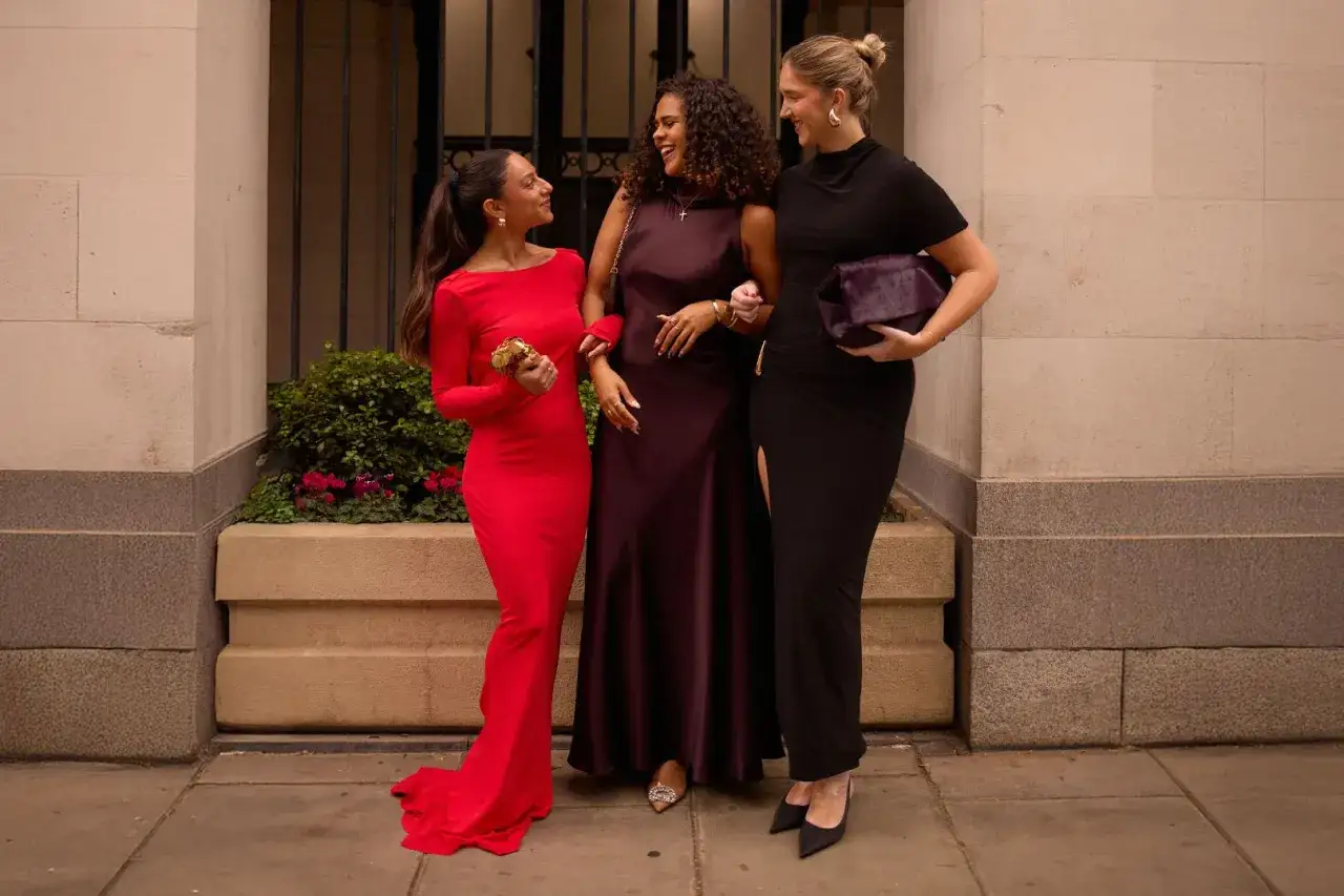
- Navy, charcoal, mid-grey, forest green, burgundy, and dusty blue are the most dependable guest colours in the UK.
- Black is usually fine for formal or evening weddings, but it should look deliberate rather than gloomy.
- Bright red, neon tones, and heavy metallic shine are the easiest ways to overdo it.
- The invitation, venue, season, and culture matter more than any single colour rule.
The safest colours to build your outfit around
If I were narrowing the field to a dependable wedding palette, I would start with the shades that look elegant in photos, fit most dress codes, and do not compete with the couple. These are the colours that work because they are quiet in the right way: they support the occasion instead of trying to define it.
| Colour | Why it works | Best use |
|---|---|---|
| Navy | Formal, versatile, and flattering in most lighting | Almost any wedding, especially if you want one suit that does more than one job |
| Charcoal grey | Slightly softer than black and very refined | Evening weddings, city venues, autumn and winter ceremonies |
| Mid-grey | Balanced and less severe than darker shades | Daytime weddings, cocktail dress codes, mixed indoor-outdoor settings |
| Forest green | Rich without being loud | Country houses, autumn weddings, winter receptions |
| Burgundy | Deep colour with character | Formal events where you want personality without shouting |
| Dusty blue | Fresh but still grown-up | Spring and summer weddings, especially in daylight |
| Stone or taupe | Light and elegant when the fabric is good | Warm-weather weddings, but only if the shade is clearly not bridal |
The pattern here is simple: the safer the occasion, the calmer the colour. Once you know your base palette, the real mistakes become easier to spot.
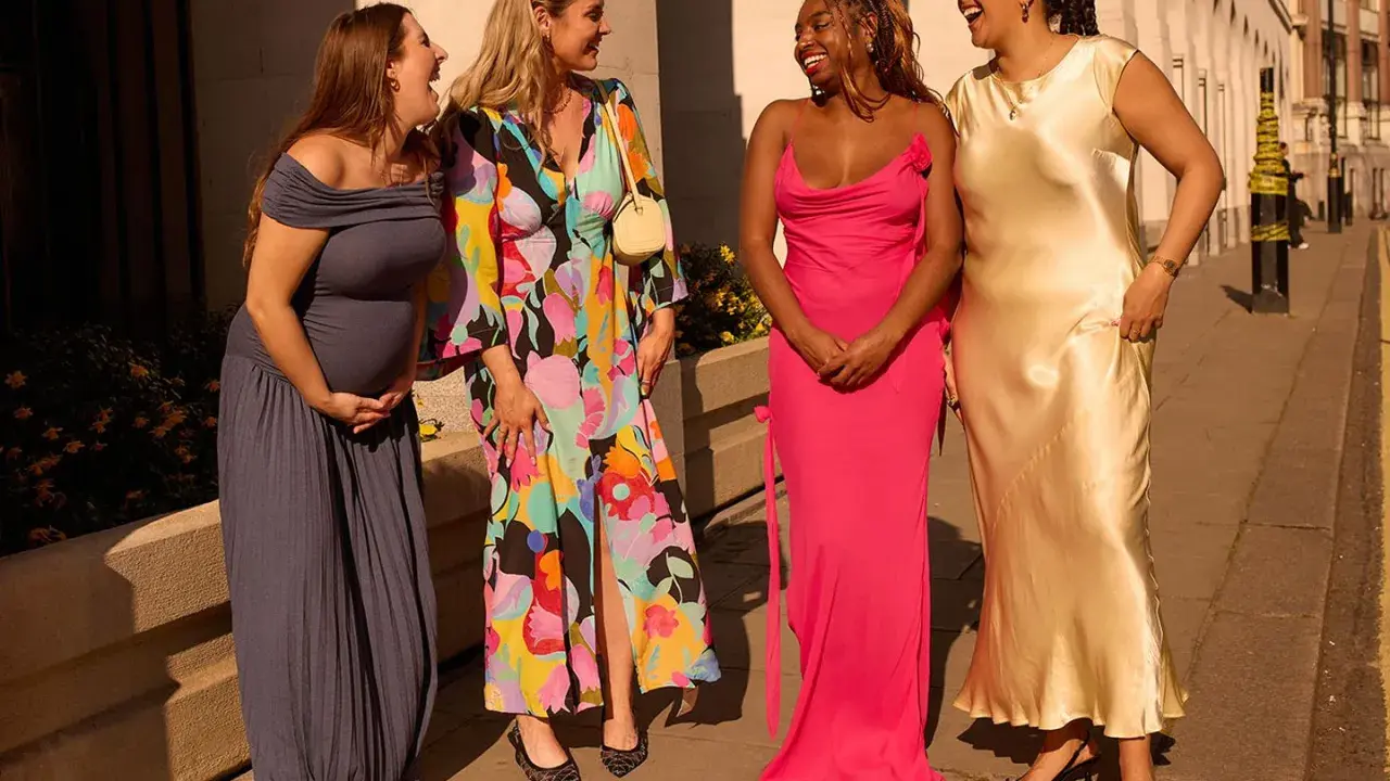
Colours to avoid or handle with caution
The most obvious mistake is still the most common one. White, ivory, cream, ecru, and pale beige belong in the danger zone unless the couple has asked guests to wear them. In photos, those shades can look far closer to bridal wear than people realise, and that is exactly the kind of collision you want to avoid.
| Colour family | Verdict | Why |
|---|---|---|
| White, ivory, cream | Avoid | Too close to the bride's traditional palette |
| Champagne, ecru, pale beige | Use caution | Can read as white under flash or daylight |
| Bridesmaid colours | Ask first | Matching the bridal party can look accidental or intrusive |
| Bright red | Context-dependent | Can dominate the room and may carry cultural meaning |
| Neon shades | Avoid | Too loud for most ceremonies |
| Heavy metallics and high-gloss sequins | Use sparingly | Can feel more nightclub than wedding |
| All-black outfits | Usually fine with context | Best for formal evening settings; less convincing at relaxed daytime weddings |
I also treat any colour that feels like it is trying to steal the frame as a warning sign. Weddings are not the place for shock value, and if you are unsure, the more restrained option usually wins.
How dress code, season, and venue change the answer
A colour that looks perfect at a city evening reception may feel completely wrong at a garden wedding in July. That is why I never judge colour in isolation. I look at the whole setting: the invitation wording, the time of day, the venue, and even the weather forecast.- Black tie or black tie optional: midnight blue, charcoal, black, and deep jewel tones usually feel right, especially in richer fabrics.
- Cocktail or lounge suit: navy, grey, soft blue, muted green, and burgundy are all strong choices.
- Daytime or garden wedding: lighter grey, dusty blue, sage, stone, and other softer tones can work well if they are not too pale.
- Country-house or heritage venue: textured cloth in navy, olive, brown-grey, or deep green tends to look especially considered.
- Beach or destination wedding: the palette can relax, but I would still avoid anything that reads as washed-out white.
Fabric matters here as much as colour. The same shade in linen, wool, or silk does not behave the same way: linen looks more casual, wool looks sharper, and anything with sheen will catch the light more aggressively. Once you let the setting do part of the work, choosing the right shade becomes much easier.
What works best for men's wedding outfits
For men, the safest starting point is still a well-cut navy or charcoal suit. Those colours are strong because they work across different dress codes, they photograph well, and they do not look like you borrowed them from a job interview. If you want more personality, add it through texture or shirt colour rather than by pushing the suit into risky territory.
- White shirt: the most reliable choice with navy, charcoal, or black.
- Pale blue shirt: softer and more relaxed, especially with grey or navy.
- Burgundy or dark green tie: enough colour to feel intentional without becoming noisy.
- Muted patterned tie: good when the suit is plain and the print is subtle.
- Black shirt: usually too fashion-led for a typical guest unless the invitation is clearly modern or evening-focused.
If you are deciding between two suits, I would usually pick the one that looks better in daylight and has the cleaner silhouette. Colour gets noticed first, but cut and fabric decide whether the outfit feels expensive or just busy.
When a bolder colour makes sense
There are weddings where a stronger colour actually improves the look. Creative couples, summer celebrations, and modern city venues often have more room for personality. In those cases, I like muted saturation rather than full brightness: a colour can be interesting without being loud, and that difference matters more than most people think.
Good examples include sage, dusty rose, lavender, rust, plum, and teal. They carry enough depth to feel dressed-up, but they still sit comfortably in a wedding environment. The risk starts when the shade turns electric, glossy, or overly shiny, because then the outfit begins to look like it wants the attention the couple should have.
- Good bold choices: sage, plum, dusty blue, rust, bottle green, soft pink.
- Risky bold choices: neon green, hot pink, electric blue, bright orange, mirror metallics.
- Best use case: creative dress codes, outdoor summer weddings, and evening receptions with a modern feel.
If you want colour but do not want risk, start with the shade and then quiet the rest of the outfit. A strong jacket needs a simple shirt and restrained accessories; otherwise the whole look starts to fight itself. That balance is what keeps a bold guest outfit polished instead of performative.
The colour rules I would actually follow on the day
When I strip all the etiquette back to something practical, the formula is straightforward. Choose a respectful base colour, avoid anything bridal or overly flashy, and let the setting tell you how much personality you can add. If the couple has given you a colour palette, follow it. If they have not, default to navy, charcoal, mid-grey, or another muted, elegant shade that suits the season.
Before I leave the house, I always check three things: does the outfit look too light in natural daylight, does it pull attention away from the couple, and does it suit the venue without feeling overdone? If the answer to any of those is yes, I change it. That is the cleanest way to look stylish at a UK wedding without making the day about your clothes.