
Colour can work brilliantly in cocktail dressing when the rest of the outfit still respects the occasion. The aim is not to look theatrical; it is to look deliberate, confident, and a touch more memorable than the man in a safe navy suit. In the UK, that balance matters because cocktail events can mean anything from a London hotel reception to a summer wedding or a gallery opening, and each setting handles colour a little differently.
The sweet spot is colour with control, not colour for its own sake
- Colourful cocktail attire still starts with tailoring, not with novelty.
- The safest route is one strong colour, then calm supporting pieces in white, navy, charcoal, cream, or brown.
- Jewel tones such as emerald, cobalt, and burgundy usually look more refined than neon or high-gloss shades.
- Matte fabrics and clean fit make bright colour look expensive; shiny cloth does the opposite.
- A tie is still the default for most UK cocktail invitations unless the dress code is clearly relaxed.
What colourful cocktail attire means in practice
For men, cocktail dress code sits in a narrow but useful middle ground: smarter than business casual, less rigid than black tie, and flexible enough to show a bit of personality. When colour enters the picture, the rule does not change; the only difference is that the outfit now has to balance formality with visual interest. I would treat that as an invitation to sharpen the silhouette first and then decide where the colour should live.
There are three reliable ways to wear colour without breaking the dress code:
- Make the suit or blazer the statement and keep the shirt and shoes quiet.
- Use colour in the shirt or tie when the rest of the outfit is traditional and you want a softer entry point.
- Use accessories as the accent if the event is formal, conservative, or unfamiliar.
Choose colours that read polished, not loud
Not every bright colour belongs at a cocktail event. The best choices are usually saturated but not fluorescent, rich but not glossy, and strong enough to register under evening lighting without turning the outfit into a gimmick. In 2026, that still means jewel tones, softened pastels, and earthy brights rather than anything that feels costume-like.
| Colour direction | Best for | Why it works | Watch-outs |
|---|---|---|---|
| Emerald green | Evening receptions, city cocktail bars, winter weddings | Rich, masculine, and easier to wear than a brighter green | Can look theatrical if the fabric is shiny |
| Cobalt blue | Most cocktail events, especially in the UK | Sharp, confident, and simple to pair with white or charcoal | Needs calm accessories or it can become too loud |
| Burgundy or wine | Winter parties, dinners, formal celebrations | Deep colour that still feels mature and elegant | Works best in a matte or textured cloth, not a glossy finish |
| Sage or olive | Spring and summer events, country-house weddings | Softens the look while keeping it distinctive | Can disappear in poor lighting if the cloth is too pale |
| Coral or terracotta | Warm-weather events, destination weddings, outdoor receptions | Fresh and lively without feeling harsh on the eye | Best kept to one garment or one accent piece |
| Deep lilac or plum | Fashion-forward cocktail evenings and creative venues | Modern and memorable when the cut is clean | Needs restraint elsewhere; avoid extra pattern clutter |
My own rule is simple: if the event is after dark, I lean toward deeper jewel tones; if it is a daytime or outdoor cocktail setting, I soften the colour and let the fabric do more of the work. That distinction keeps the outfit from feeling overcooked, which leads neatly into the actual combinations I would wear.
The outfit formulas I would actually wear
When people ask me how to wear colour well, I usually start with complete outfits rather than isolated garments. That is because cocktail dressing fails most often at the combination stage, not at the shopping stage. A beautiful jacket can still look wrong if the trousers, shirt, or shoes fight it.
| Occasion | Outfit formula | Why it works |
|---|---|---|
| Evening wedding reception | Emerald suit, white dress shirt, black Oxford shoes, silk knit tie | Formal enough for the room, but the colour gives it personality without shouting |
| Smart London cocktail bar | Cobalt blazer, charcoal trousers, pale blue shirt, dark brown loafers | The blazer does the talking while the rest of the look keeps the temperature under control |
| Summer garden party | Sage blazer, cream trousers, white or ecru shirt, suede loafers | Light, breathable, and photogenic without drifting into holidaywear |
| Winter dinner or drinks reception | Burgundy suit, ivory shirt, black loafers, discreet pocket square | Moody and elegant, with enough depth to handle evening lighting |
| Safer first step | Navy suit, white shirt, patterned tie in green or coral, brown shoes | A controlled way to test colour without committing to a full statement suit |
These formulas work because they each give the eye one clear point of focus. If you want the colour to feel intentional rather than random, resist the temptation to make everything interesting at once. One statement piece is enough; two is sometimes possible; three usually becomes noise.
Fabrics and tailoring decide whether colour looks expensive
Bright colour is unforgiving. A poor fit, a cheap synthetic cloth, or an over-shiny finish becomes obvious much faster on a coral jacket than on a standard navy suit. That is why I pay as much attention to cloth and cut as I do to the shade itself.
- Wool and tropical wool are the safest all-round options because they hold shape and still look elegant indoors.
- Hopsack works well for textured blazers, especially in blue, green, or burgundy.
- Linen blends are excellent for warm-weather events, but I would accept some creasing and keep the colour refined.
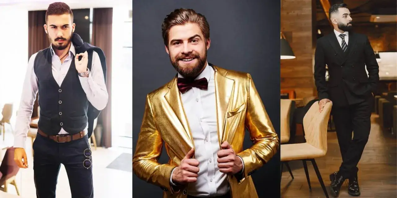
- Mohair blends add depth and a little sheen, but too much shine can push the look toward evening costume.
Shoes, shirts, and accessories should calm the colour down
The supporting pieces are where most men either save the outfit or ruin it. My default is always a crisp white shirt, because white gives colourful tailoring room to breathe and keeps the look anchored in dress-code territory. Pale blue can work too, especially with navy, cobalt, or sage, but I would avoid competing shirts unless the rest of the outfit is extremely restrained.
Shoes should follow the same logic. Black Oxfords are the safest choice for the darkest and most formal looks. Dark brown brogues or loafers work well with richer colours in daylight or early evening, while suede loafers feel right for warmer months and softer palettes. I would avoid chunky soles, trainers, and anything that drags the outfit toward casual streetwear.
Accessories should add texture, not extra volume. A tie in grenadine, silk knit, or a small geometric pattern usually looks better than a loud print. A pocket square should echo one colour in the outfit, not match the tie exactly. If you wear a watch, keep it slim and quiet; a simple dress watch with a leather strap and a case around 36-40 mm is usually the right scale for a cocktail cuff.
The principle is easy to remember: if the jacket is doing the talking, everything else should lower its voice. That leads directly to the mistakes I see most often when men try to wear colour.
The mistakes that make colourful tailoring look forced
I see the same problems repeatedly, and they almost always come from overcorrection. A man buys a bold jacket and then tries to make the rest of the outfit equally memorable. That is where things break.
- Wearing a bright suit with a loud shirt, patterned tie, and statement pocket square at the same time.
- Choosing a shiny synthetic fabric that reflects too much light and makes the colour look cheaper.
- Ignoring the venue and wearing something that belongs at a rooftop party to a formal hotel reception.
- Using a collar, tie, and jacket combination that would be fine in office wear but feels flat for cocktail dress code.
- Picking shoes that are either too casual or too aggressive for the rest of the look.
- Forgetting that daylight, candlelight, and warm indoor lighting all change how colour reads.
The easiest fix is to ask one question before you leave the house: does the outfit have a focal point, or does it have several competing ideas? If the answer is the second one, remove one layer of interest. Colour should make the look clearer, not busier. Once that filter is in place, deciding whether the outfit is right becomes much simpler.
The easiest way to decide if your outfit is right
When I am unsure, I use a short checklist. It keeps the decision practical rather than emotional, which is useful because colourful dressing can tempt people into either playing it too safe or going too far.
- Is the silhouette classic enough that the colour feels intentional?
- Is there only one dominant colour story in the outfit?
- Would this still look right at a London dinner, a wedding reception, or a gallery opening?
- Do the shoes and accessories support the outfit instead of competing with it?
- Does the fabric look matte or textured rather than shiny and synthetic?
If the answer to those points is yes, the outfit is probably in the right zone. My final rule is simple: choose the colourful piece you will wear more than once, not the loudest piece you can find. That way, the look stays useful, the dress code stays intact, and the colour actually earns its place in the wardrobe.